WAVE Accessibility Report

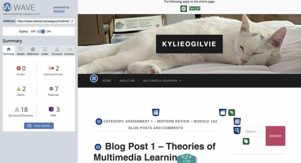
When I ran my WAVE accessibility report on my blog posts I was happy to see that I only had two contrast errors. I honestly was having a bit of difficulty seeing the text in the colour that I had chosen previously. When writing my second blog post I decided to darken the colour a bit to increase the contrast which really helped, and I assume contributed to my low contrast error score. I am surprised that I got a contrast error on the text that I have in grey. To me, the contrast looks sufficient, but I am not thinking like someone who has worse vision needs than my own. Going forward I am going to change this text colour to a darker grey or even black and keep in mind that those who access my blog posts may have worse vision than I do.
My Experience with Text to Speech
I have used text to speech before for projects in high school. Unfortunately, I did not find it useful as the projects were presentations in my French class and the pronunciation on the application I used was horrible. While the text to speech allowed me to practice certain phrases or words, I couldn’t get a good idea of how the French should be pronounced. Most of the time, the speaking voice was saying the French words with a half French half American accent, so I had better luck understanding the pronunciation from my teacher. I can see how text to speech would really help people with other topics or if I found an accurate French voice. I tend to have issues processing information auditorily so this would not be my chosen learning tool if I didn’t have to know how to pronounce something.
Definitions and Experiences with Inclusive Design
To me, inclusive design means designing media or multimedia with the awareness that learners have varying ranges of needs and accommodating to these needs. I personally have ADHD and with the advancements in graphic design with clear labels, easy to navigate tools, and attention-grabbing elements I have never had an easier time learning. Things like subtitles which may have been intended for those with hearing issues also help me with my auditory processing issues. Of course, I can also see how certain applications such as TikTok or Instagram with an endless scrolling design can also take advantage of those of us with poor executive function and low attention spans. For the most part, I think these shorter video platforms can be extremely effective learning tools for those of us with varying needs but self-regulation and staying on topic can be a huge barrier to effective learning.
My Infographic
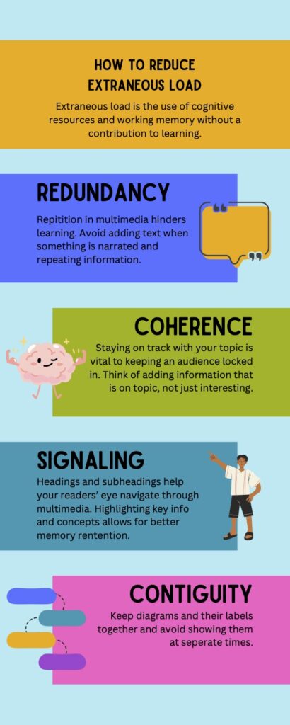
I used contrast and differing colour to help my learner navigate through my infographic. This follows the signalling and coherence principles. I did focus on alignment by aligning all elements on the left or right side of the text box, with all text boxes alternating on which side they sit on. I kept proximity in mind by having the elements that I chose to have on the side of text boxes be representative of their respective topic. I followed the signalling principle by aligning the introduction text box to the middle of the infographic. I optimized colour to allow for easy transitioning between topics with high contrast between text colour and background colour.
The template that I chose really helped me design how I could allow for an easy transition between the four principles. The only issue that I found with this template was that the colour contrast was not very high and that the chosen elements were a bit too generic for my topic. The template allowed me to see the potential of what my infographic could look like, while Canva allowed me to easily change and edit what I needed to to allow for a more accessible infographic.

Recent Comments